
Vertical browser tabs have had years to win me over, but after testing them in just about every browser I could get my hands on in 2026, I’m still firmly on team horizontal tabs. It’s not because I’m afraid of change. I spend hours each day juggling windows, tabs, and sites across multiple screens, and the vertical layouts I’ve tried in Arc, Zen, Edge, and others keep introducing friction where there shouldn’t be any.
As someone who works with four monitors, browser behavior across displays matters more to me than most other features. In Chrome or Edge, dragging a tab to another monitor is simple: the tab detaches and becomes a new browser window exactly where I want it. That workflow is seamless and predictable. Vertical-tab browsers, especially Arc and Zen, are not nearly as smooth. If my displays are lined up bezel to bezel, a vertical tab bar can break the visual flow between two pages I’m comparing. Hiding the sidebar might restore some of that flow, but then I quickly lose track of which tabs are open on which screen. For a multi-monitor setup, that’s a serious downgrade.
🗂️ Grouping and organizing get messy
Horizontal tabs win on organization for me, too. I can group horizontal tabs by project, collapse entire groups when I don’t need them, and reopen them with one click. Vertical tabs often show more tab titles, but that extra visibility comes with a cost. In many implementations, grouping is absent or limited, so I end up with another long list to scroll through instead of a tidy row. Some browsers let you pin tabs on the vertical sidebar, but pinned items can eat up so much space that regular tabs get pushed far down. That means more scrolling, more searching, and more chances to lose track of something important.
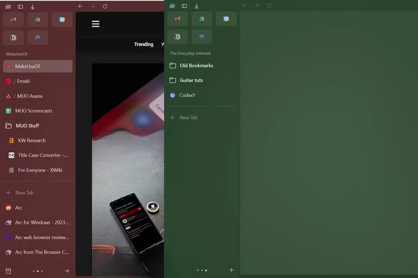
This is partly personal preference. Most of us grew up with horizontal tabs before vertical options went mainstream, so organizing them feels natural. Still, after weeks of giving vertical tabs a fair shot, I found my tab management felt slower rather than faster.
📏 Screen real estate still matters
Vertical tabs can quietly eat your workspace, especially if you’re on a 13-inch or 14-inch laptop. The problem gets worse when you use split-screen windows. On a small display, a vertical tab sidebar might take half of one window’s width, leaving very little room for the actual page. Unless you constantly collapse and expand the sidebar, you’re sacrificing usable space.

Some people prefer the extra vertical reading height. That’s valid. But when I have three or more tabs open in split-screen mode, the width penalty becomes impossible to ignore. Horizontal tabs sit in a thin strip at the top and stay out of the way.
🌐 Some websites don’t play nicely
Another issue I keep hitting is website rendering. Plenty of sites don’t use the full width of a modern monitor, and they can behave strangely when a vertical tab sidebar is open. Collapsing and expanding the sidebar over and over again sometimes leaves overlapping menus, misaligned icons, or completely missing controls. I’ve noticed this most on vertically scrolling sites like X and Instagram, where important buttons and links often sit near the edges of the viewport.
A hard refresh usually fixes the problem, but by then I’ve already misclicked or lost a link. If a site refuses to cooperate, I have to pop back to horizontal tabs or even switch browsers, which defeats the purpose.
🧭 Why horizontal tabs still win for me
Here’s the simple version:
-
✅ Easier to move tabs between windows and monitors
-
✅ Better native grouping and collapsing
-
✅ More reliable website rendering
-
✅ Less wasted screen space on small devices
-
✅ Always visible in one predictable spot
| Feature | Horizontal tabs | Vertical tabs |
|---|---|---|
| Multi-monitor support | ✅ Smooth detach and reattach | ❌ Can break visual flow |
| Grouping | ✅ Native and intuitive | ❌ Often missing or limited |
| Small-screen usability | ✅ Narrow top bar | ❌ Sidebar can dominate |
| Website compatibility | ✅ Very consistent | ❌ Occasional rendering quirks |
That doesn’t mean vertical tabs are useless. If they were implemented with better multi-monitor support, smarter grouping, and less screen intrusion, I’d happily reconsider. But in 2026, the implementations I’ve tried in Arc and Zen still leave too much to be desired on Windows. For now, horizontal tabs remain my default. They’re not flashy, but they’re dependable, predictable, and so much easier to live with.
According to coverage from CNET - Gaming, interface choices that look “modern” can still hurt day-to-day productivity when they add extra steps or reduce usable workspace—especially on laptops and split-screen setups. That perspective mirrors the trade-offs described here: vertical sidebars can reclaim a bit of vertical height, but they often tax width, introduce more scrolling and hiding/showing behavior, and make multi-display workflows feel less predictable than the familiar, low-friction horizontal tab strip.